How to Improve Website Conversion: 9 Changes That Make It Easier to Say Yes
Your website is getting visitors. People are clicking around. Google Analytics confirms actual humans have, in fact, entered the premises. And yet… not enough of them are inquiring, booking, signing up or buying.
So naturally, you want to know how to improve website conversion without immediately rebuilding your entire website, changing your brand colors and deciding your logo was the problem all along.
Good news: you probably don’t need to burn everything down.
The best website conversion improvement usually comes from making your website easier to understand, easier to trust and easier to act on.
That means clearer messaging. Better calls to action. Less unnecessary stuff. More proof. And a website journey that does not feel like your visitor accidentally wandered into an escape room.
Let’s get into it.
What Even Is a Website Conversion? Learn The Basics Here →
How To Improve Website Conversion?
If you want the short version, how to improve website conversion comes down to removing the things that make it harder for the right visitor to understand, trust and take action on your website.
Start here:
Make it immediately clear what you do and who you help.
Explain why your offer matters to them.
Give every important page one primary next step.
Add proof where people are making decisions.
Make your copy easy to scan and understand.
Reduce unnecessary choices and friction.
Check your website on mobile.
Make sure the right people are actually reaching your website.
Track changes instead of randomly tweaking things because Tuesday felt like a good day to redesign a button.
Simple? Yes.
Always easy? Lol. No.
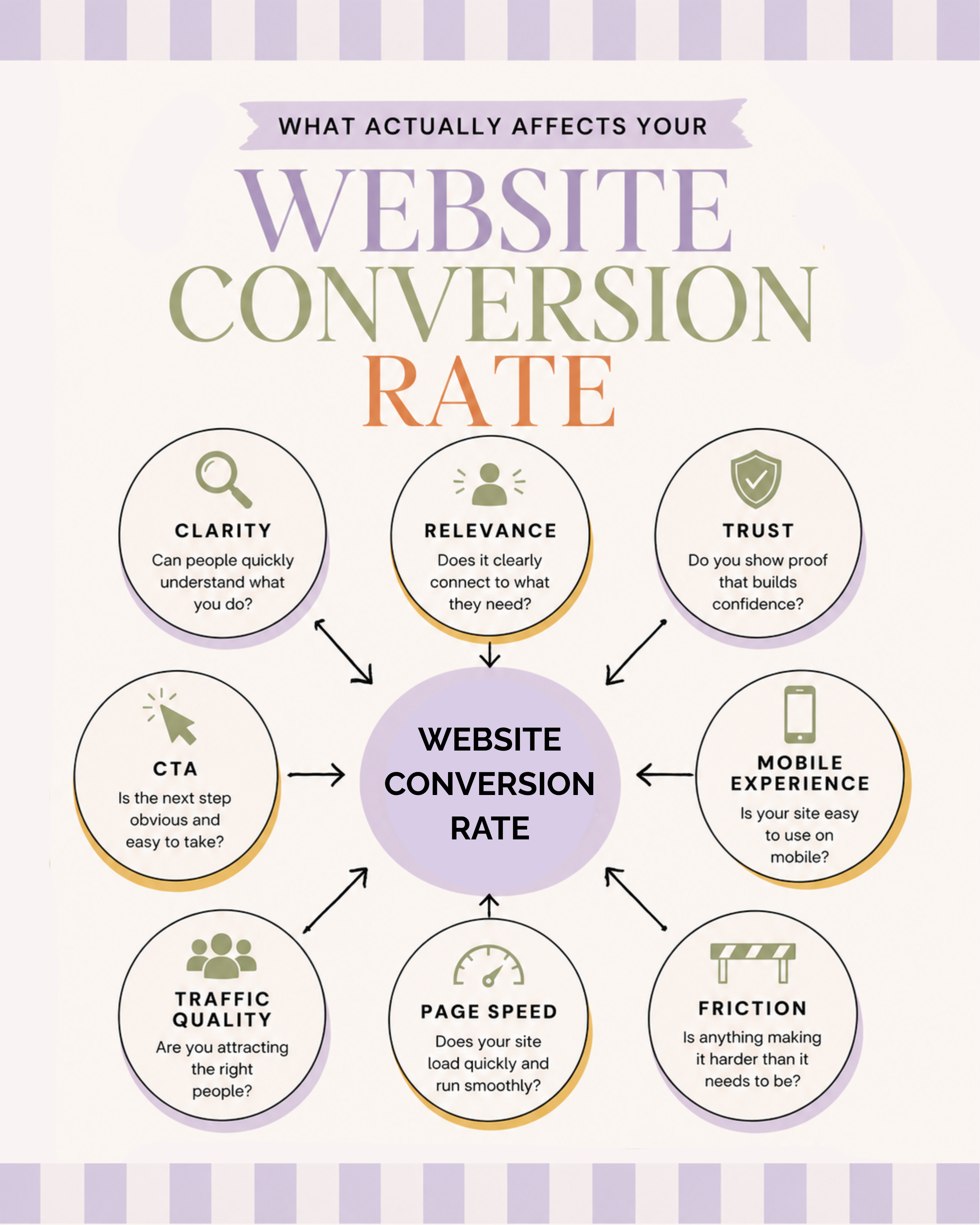
Start With The Goal
Before changing anything, decide what you actually want visitors to do.
A website cannot effectively guide someone toward a goal if you haven’t decided what that goal is.
For a service business, it might be: Homepage → services → inquiry
For someone selling digital products: Blog post → product page → purchase
For a business using content to grow its audience: Blog post → email signup
You can have several conversions across your website, obviously. But each important page should have a clear purpose.
Ask yourself: What is the main action I want someone to take after reading this page?
If your answer is: Well, they could book a call, join my newsletter, follow me on Instagram, read six blog posts, download my freebie, listen to my podcast and perhaps investigate my childhood hobbies… We have found our first problem. Your visitor should not need a committee meeting to decide what happens next.
Once you have a clear goal, follow this 9 tips that can improve your website conversion rate.
1. Make It Painfully Obvious What You Do
One of the easiest ways to improve website conversion rate is also one of the least glamorous: Be clear.
Someone landing on your homepage should be able to figure out what you do without scrolling through five sections, solving a riddle or becoming emotionally attached to your About page.
Your headline and supporting copy should answer some version of:
What do you do?
Who is it for?
Why should they care?
Take something like: Strategic brand experiences for ambitious visionaries.
Okay. What… happened?
Compare that with: Website copywriting for women-led businesses that want to connect and sell without sounding sleazy.
Much easier.
Being clear does not mean becoming boring. You can absolutely have personality. You can be clever. You can make jokes. You just can't make the reader decode your business before they're allowed to understand it.
Clarity first. Personality second. Ideally, you get both.
And yes, I know “strategic brand experiences” sounds fancy. So does a restaurant menu written entirely in French. Still not particularly helpful if I just want to know whether they serve pasta.
2. Tell People What's In It For Them
Here's another big part of how to improve website conversion: stop assuming people automatically understand why your service matters.
You know your offer inside out. Your visitor does not.
If you say: “I provide personalized nutrition plans”…
Cool. But what does that do for the client? Does it help them figure out what to eat without Googling every ingredient? Make grocery shopping easier? Give them meals that actually fit their schedule, preferences and goals? Stop the daily “what the hell am I supposed to make for dinner?” debate?
Connect what you offer to what your reader actually wants.
Features explain what they get. Benefits explain why they care. You usually need both.
For example:
Feature: A personalized nutrition plan based on your needs and lifestyle.
Benefit: Get more energy, lose excess body fat and give your body what it needs, without giving up pasta, your favorite snacks or your Friday-night glass of wine.
People aren't sitting at home desperately craving “a personalized nutrition plan”, they want what that plan can help them do. That's the bit your copy needs to make obvious.
3. Use Specific Copy Instead Of Professional-Sounding Fog
If you want meaningful website conversion improvement, specificity is your friend.
Generic copy makes people work harder. Specific copy lets them recognize themselves.
Example for an interior designer:
Compare: Take your home to the next level with customized design solutions.
To: Create a home where the colors actually work together, every awkward corner has a purpose and you finally stop wondering whether that rug is too small.
The second version tells me considerably more.
Look through your website for phrases like:
tailored solutions
elevate your brand
transform your business
innovative approach
personalized support
achieve your goals
take things to the next level
Sometimes they're appropriate, but often they're just filling space where an actual thought should be.
Try asking:
What specifically happens?
What specifically gets easier?
What problem goes away?
What does the person have after working with me that they didn't have before?
Those answers are usually much more persuasive than whatever corporate soup you were about to put there.
Improve Website Conversion Rate With Better CTAs
A call to action tells people what to do next. That's its job.
Not to win a poetry award. Not to prove how quirky you are. Not to say Explore the Possibilities and leave your visitor wondering whether they're about to book a copywriter or enter Narnia.
If you want to improve website conversion rate, your CTA needs to be easy to notice and easy to understand.
That doesn't mean every button needs to say “BUY NOW.” Your CTA can still sound like you.
For example:
Nutritionist: Show me how we can make food easier
Interior designer: Let's make this room make sense
Web designer: Yep, my website needs help
Virtual assistant: Please take this off my plate
Psychotherapist: Explore therapy options
Dog trainer: Help me with my tiny menace
The important part is that the surrounding copy makes the next step clear.
And here's something people sometimes mix up: you can have the same CTA multiple times on one page. In fact, that can be helpful because someone who's ready halfway through shouldn't necessarily have to scroll for another five business days before they're allowed to click.
What you usually want to avoid is having five completely different primary actions competing for attention.
Your Services page saying: Inquire! Read the blog! Join my newsletter! Follow Instagram! Download this! Look, a dog! …is not helping.
4. Give Important Pages One Primary Job
This is closely connected to CTAs, but it's bigger than the button itself.
If someone is reading your service page, what is that page for? Probably helping them decide whether your service is right for them and, if it is, encouraging them to inquire. So everything on that page should support that decision.
Your headline. Offer description. Benefits. Pricing information. Testimonials. Process. FAQs. CTA.
When deciding how to improve website conversion, look for anything distracting visitors from the main purpose of the page.
You don't have to delete your personality. You don't need a minimalist website containing six sentences and one aggressively large button. Just make sure the information earns its spot.
My favorite test is: Does this help someone understand, trust, want or act on the offer?
If the answer is no… Why is it there?.
5. Put Proof Near The Decision
You can tell people you're fantastic. And naturally, I support your right to think very highly of yourself. But when other people say you're fantastic, it carries different weight.
Testimonials, reviews, case studies, portfolio examples, relevant credentials and specific client results can reduce uncertainty because your visitor no longer has to take your word for everything.
For bigger website conversion improvement, don't hide all your proof on one Testimonials page that visitors have to deliberately hunt down. Put relevant proof near the places where they're making decisions.
Selling dog training packages? Add a testimonial from the client whose dog used to treat every Amazon delivery like an attempted home invasion near the offer designed to help with barking and reactivity.
Talking about how realistic your training approach is? Show me the testimonial from the person who says they could actually follow your advice without quitting their job to become a full-time dog behavior specialist.
Claiming your clients feel supported throughout the process? Don't just tell me. Show me the review from someone who says you answered their 47 panicked questions and helped them understand what to do when Buddy inevitably decided the rules no longer applied.
Basically: claim + evidence is much stronger than: claim + another claim + another claim + trust me sis.
One important note: if you use client results or testimonials in your marketing, keep the claims accurate and representative. Don't turn one unusually strong outcome into an implied guarantee that everyone will get the same thing.
6. Make Your Website Ridiculously Easy To Scan
Want another way to improve website conversion rate? Stop requiring people to read every word.
I say this as someone who literally earns money writing the words. It hurts. But it's true.
People skim websites. Help them.
Use:
descriptive headlines
clear subheadings
short paragraphs
bullets where they genuinely make information easier
visual separation between sections
bolding for important points
buttons people can actually see
If somebody spends 30 seconds on your service page, they should still understand the basics:
What do you offer?
Who is it for?
Why might they want it?
What does it cost, if pricing is public?
What do they do next?
Don't bury crucial information halfway through a 900-word personal essay about the spiritual awakening that led you to create Package Two.
7. Remove Unnecessary Decisions
More choice feels helpful. It isn't always.
If someone has to choose between nine different services, four freebies, three consultation types and an unexplained button called “Explore,” you've given their brain a small administrative job.
You want the journey to feel simpler.
This doesn't mean your entire business can only have one offer. It means organizing your offers so people can quickly understand: Which option is for me?
If your packages are similar, clearly explain the difference.
If you have multiple services, group them logically.
If your navigation has 14 links, ask whether all 14 deserve prime real estate.
If your contact form requests their birth time, blood type and a 750-word essay about their brand vision… Perhaps reconsider.
Reducing unnecessary decisions is one of the most practical ways to improve website conversion rate because you're making the action itself easier.
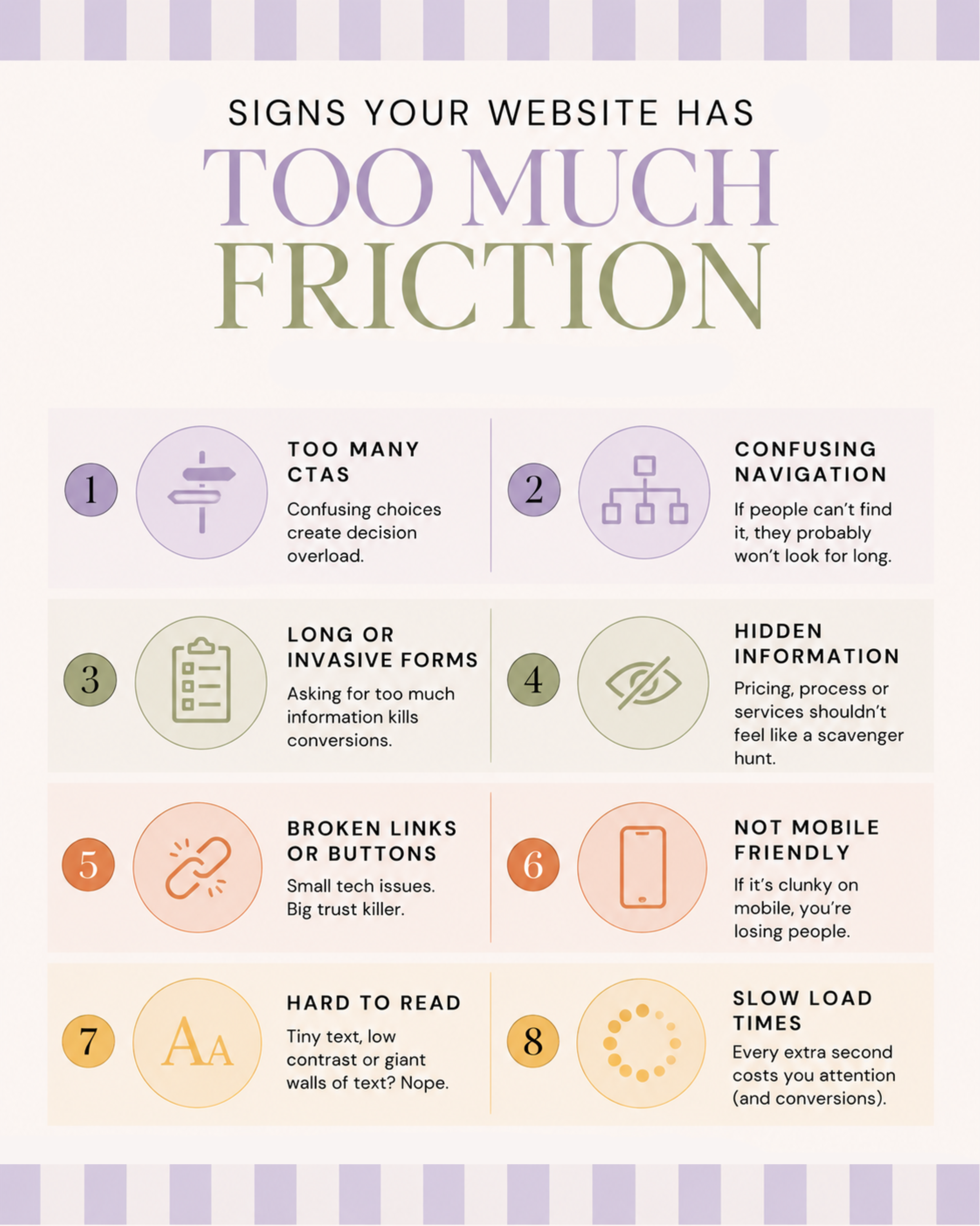
8. Make Mobile An actual Priority
Your desktop website may be stunning. Elegant. Balanced. A visual masterpiece.
Then you open it on your phone and the headline occupies nine lines while a floating button covers half the paragraph. Excellent.
As a desktop girlie, it pains me to say this, but it’s true: most people are checking out your website on their phones, so check every important page on mobile version.
Pay attention to:
Text size: Can people read it comfortably?
Buttons: Are they easy to tap?
Paragraphs: Do previously reasonable paragraphs now look like a dissertation?
Images: Are they pushing important information too far down?
Forms: Can someone complete them without developing a personal vendetta against you?
Navigation: Can people find what they need quickly?
But don't just check whether the mobile site technically works. Check whether it feels easy. Those are not the same thing.
9. Make Sure You're Attracting The Right Traffic
This part gets ignored constantly.
You can have exceptional copy and a beautiful website, but if the wrong people are visiting, your conversion rate can still look terrible.
If 1,000 people arrive on your website because one random blog post about your dog went viral, and none of them need your services… Your homepage isn't necessarily the problem.
Before deciding how to improve website conversion, look at where visitors are coming from.
Search? Pinterest? Instagram? Referral links? Emails? Paid ads?
Which sources bring people who actually inquire, subscribe or buy?
Because your goal isn't simply more traffic. It's relevant traffic. I'd much rather have 300 people arrive who are genuinely interested in what you sell than 30,000 people who arrived because Google briefly decided you were the international authority on Labrador Halloween costumes.
Traffic and conversion work together. Your website cannot convert someone who was never a realistic client in the first place.
10. Test Changes Instead Of Performing Random Website Surgery
And now, the least sexy part of how to improve website conversion: Measure what happens.
I know. We were having fun.
But website conversion improvement becomes much more useful when you make intentional changes and track whether those changes actually helped.
Let's say you rewrite your homepage headline.
Don't simultaneously:
change the headline
redesign the entire hero section
remove three services
replace your CTA
change your pricing
install seven new plugins
sacrifice a goat to Google Analytics (maybe don’t do that one, like, ever. We love goats here)
Because even if your conversions improve, you won't know why.
Where possible, make a meaningful change. Track it. Give yourself enough data. Learn. Then make the next change.
Change one thing. Test it. Learn from it.
Much less radical. Much more useful.
Can Copy Improve Website Conversion Rate On Its Own?
Sometimes copy is the biggest issue. Sometimes it isn't.
Clearer messaging can improve website conversion rate when visitors currently don't understand what you offer, why it matters, who it's for or what they should do next.
But copy cannot magically fix:
an offer nobody wants
irrelevant traffic
a broken checkout
painfully slow pages
confusing design
prices that don't match the market or perceived value
technical problems
a terrible customer experience
That's why I don't love sweeping claims like: “Change these three words and DOUBLE YOUR CONVERSIONS!!!!!”
Could a copy change improve performance significantly? Sure.
Can anyone responsibly guarantee that without knowing your traffic, website, audience, offer and existing numbers? Nope.
Your copy is one piece of the system. A pretty damn important piece, in my extremely unbiased copywriter opinion. But still one piece.
How Long Does Website Conversion Improvement Take?
There isn't one universal timeline for website conversion improvement.
A technical fix, like repairing a broken inquiry form, could make an immediate difference. A messaging change may need enough traffic before you can judge whether it helped. SEO-related traffic improvements can take considerably longer. And if your website only gets 40 visitors a month, two additional inquiries can make your conversion rate swing dramatically.
So don't judge every change after three days.
What Should You Improve First?
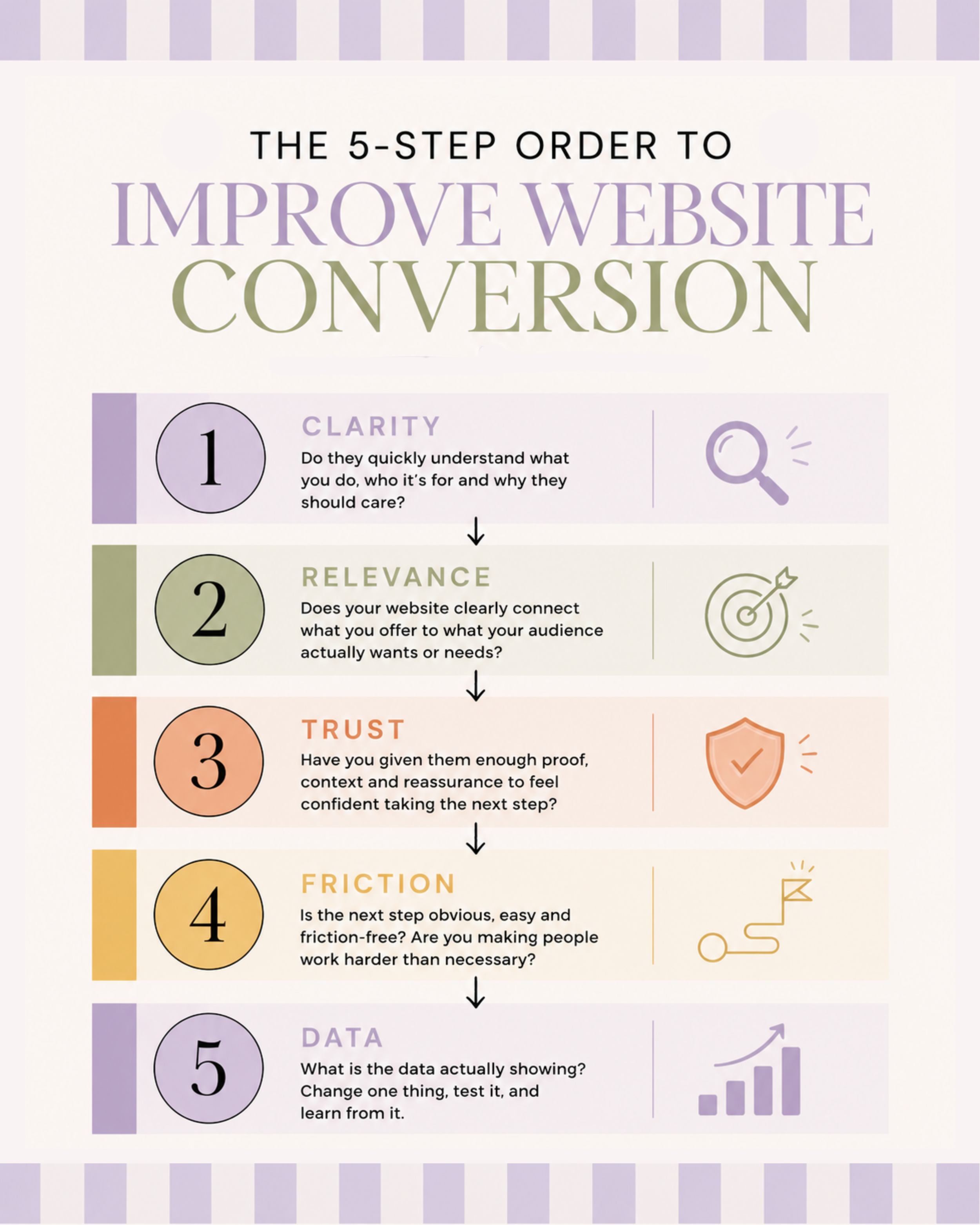
If you're staring at your website thinking: “Okay cool, that's a lot”, use this order:
Start with clarity.
Can someone quickly understand what you do, who it's for and why they should care?
Then check relevance.
Does your website clearly connect what you offer to what your audience actually wants or needs?
Then build trust.
Have you given people enough proof, context and reassurance to feel comfortable taking the next step?
Then remove friction.
Is your CTA obvious? Is the page easy to use? Are you making people work harder than necessary?
Then look at the data.
See what people are actually doing, change one thing, and test it.
Clarity → Relevance → Trust → Friction → Data
Make sure they understand it. Make sure they care. Give them a reason to trust you. Make taking action easy. Then use the data to decide what needs attention next.
TL;DR: How To Improve Website Conversion?
Ultimately, how to improve website conversion isn't about learning increasingly aggressive ways to push visitors toward a button. It's about making the decision easier.
Help the right people recognize they're in the right place.
Explain what you do clearly.
Show them why it matters.
Give them enough information to make an informed decision.
Build trust.
Remove unnecessary friction.
Tell them what happens next.
And then let them decide.
That's also why your website conversion improvement strategy should never be: “How do I pressure more people into saying yes?”
A much better question is: “What is currently making it unnecessarily hard for the right person to say yes?”
Fix that.
Your website doesn't need to corner people. It needs to communicate well.
And when it does? Funny how much easier converting becomes.
Okay, But What If Your Website Still Needs Help?
Maybe you’ve made it this far and realized your website has a few more problems than you thought. Whoops.
Good news: you do not have to close this tab and spend the next six hours rewriting your homepage while questioning every sentence you’ve ever written.
You have many options, but here are my favourite 2:
If you’re more of a “lemme fix it myself first” person:
Grab my free Website That Sells Checklist. It’ll help you spot the tiny gaps, confusing bits, and “wait...what does this mean?” moments that could be making it harder for people to say yes.
Give your website a little check-up →
If you want someone else to handle it:
I write strategic, personality-packed website copy that makes it stupidly easy for the right people to understand what you do, why they should care, and what the heck they should do next.
Check out my website copywriting services →
Either way, please don’t let “eh, it’s probably fine” be your website strategy. Your website deserves better. And so do the people trying to figure out how to hire you.